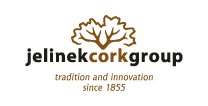
The Jelinek Cork logo has undergone several transformations over the years. The most recent logo was designed, approved and put into action in 2008. Michal Macko, a graphic designer in Bratislava, created the logo as an entry for a logo design competition. The competition was developed by Korok Jelinek for the University of Graphic Design in Bratislava, Slovakia.
The Jelinek Cork logo symbolizes many things:
The tree represents the cork oak tree – the source of cork.
The tree also represents nature and the environment – issues Jelinek Cork Group cares deeply about.
The tree branches represent deer antlers and the Jelinek name. In Czech, the word “Jelinek” means “little deer”.
Finally, just as cork is stripped off the tree and then regrown, so are the antlers of a deer – they are shed each year and then regrown.

